Test the new look of addons.mozilla.org!

Not meeting the requirements of currently released versions of Firefox at a critical time

Background

… can’t tell anymore …

… no indication of whether either is supported in Firefox 57 …

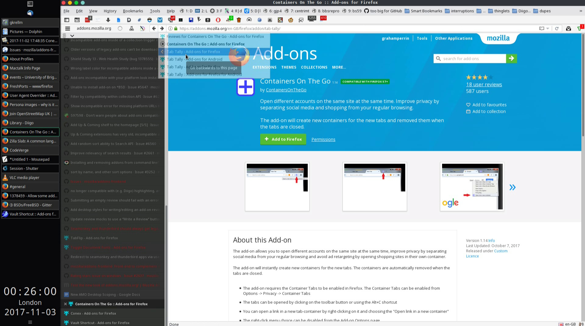
How can I see if an addon is FF 57+ ready now?

… A Firefox 56.0.2 view of pages such as … offers no hint that Firefox 57 will not work with such things.

A number of workarounds are possible.

  • read two windows alongside each other for a single extension.

Clearly this is far from ideal. … I’m very surprised by the current situation. I do know that at least one feature of the new site was recently temporarily, properly removed in response to user testing.

Maybe some other feature of the site was very recently removed without realising the consequences. …

Also:

… less than two weeks before Firefox 57 lands into the Release Channel, it will be a frustrating experience when we tell users to start looking for 57+compatible extensions when the addons.mozilla.org page they see doesn’t tell them and they have to install an extension to find out. After 57 lands, one won’t …

2 Likes

Backwards, forwards not working as expected (edge case)

Two frames from a screen recording:

The URL changed – to the page for Tab Tally – but navigation did not occur; Firefox 56.0.2 continued to present the page for Containers On The Go.

At the time of those two frames:

  • User Agent Overrider was not applied
  • View classic desktop site applied.

An edge case, I reckon (I’ll not raise an issue in GitHub) because there was a prior change of agent to gain the classic look – in response to a SeaMonkey string (as specified in User Agent Overrider):

FreeBSD / SeaMonkey 2.49.1: Mozilla/5.0 (X11; FreeBSD amd64; rv:52.0) Gecko/20100101 Firefox/52.0 SeaMonkey/2.49.1

Related:

You can switch to the desktop version for now, if you miss the older look

I’m not sure if I’m a little blind here, but I don’t see a way to check on a WebExtension’s permissions in the new design…

3 Likes

To be honest, I don’t like very much the new look of Mozilla Addons. Maybe it’s not to my taste, but everything on the site has become too big (and you need to scroll a lot to see items downwards), with rather ugly motley colors and the same sketchy icons that repel me in Windows 10. Maybe this is the new culture trend, I don’t know, but it doesn’t just appeal to me. Otherwise the functionality is ok, I just don’t approve so much the looks. The old version was somewhat cleaner and easier to navigate, with more beautiful icons and colors… I hope the link to it would stay for the future…

3 Likes

@Hamsterkill I tried three or four times to add a comment, with reference to the comments under your https://www.reddit.com/r/firefox/comments/7adng2/did_the_addon_page_change/dpa34zl/, but I’m having difficulties in multiple browsers (https://status.github.com/messages shows “All systems reporting at 100%” but comment texts seem to be disappearing into the ether). Reported to GitHub.

I don’t like the new view at all. It’s extremely cold and sterile and VERY lacking of important information such as what versions the add-on is compatible with, etc. This makes it even worse when you are trying to find replacement add-ons that meet the new web-extension standard. And having to click “Read more” to see the description is ridiculous. It needs to be full page front and foremost.

The previous version, which I immediately reverted back to, had finally progressed to near perfection. Why change something that works great? Don’t ‘fix’ what isn’t broken. The only thing I can think of that may have been a slight improvement for the previous version would be to move the Version Information, Development Channel and Developer’s Comments sections from the bottom of the page, up to the top, below the Add to Firefox button. I was so pleased with the fact that in the Add-on search results, you had added a green “Compatible with Firefox 57+” indicator, which was a wonderful idea. Then you turned around and removed it in the new version. No steps forward, 10 steps back.

The changes made to the Add-ons page is comparable to taking a nice car, taking out the leather power seats and putting in wooden kitchen chairs and removing all of the numbers from all of the dials in the dash.

2 Likes

Also, when viewing a Theme, there is no more Add to Favorites feature, which I liked and actually used when I got bored with my current theme.

1 Like

Happy with new look but its just not usable at all now! As stated by other replies, there is no Firefox 57 compatibility sort feature.
Luckily I had just finished initial review of my extensions for the coming Firefox 57 the day before the new site layout. But now it is way too hard to determine from a search if I am looking at FF57 compatible ones.

5 Likes

HELP!!!
The new site does NOT render properly on FF16 nor FF48 and very little is functional! Cannot search, clicking on most links does nothing…etc…

I can click on My Collection to take me there but if I select ANY collection, rendering is so bad that the text is almost all single characters in ONE COLUMN VERTICALLY, so I cannot use the page at all!!!

This means that I am cut off from ALL add-ons for ALL my versions of FF. I am dead in the water regarding addons, accessing or managing them etc.

This effectively means that if others are experiencing the same thing, they are all cut off!

I have to resort to Chrome 49 just to look up anything.

Note: I am still on Mac OS X 10.6.8 so I cannot upgrade FF beyond 48.0.2 at this point in time.

I hope something can be done about this…and hopefully soon…

HELP!!!

P.S. Not sure what it is suppose to look like in FF but the site has far too much white space, at least in Chrome…a lot of wasted space, where there used to be more useful info…

1 Like

Totally love the new design. Personally, I don’t have any major problem using it. I only need to get used to it.

And here we go;

  • The way to sort or only show extensions with minimum compatibility Firefox 57 (WebExtension/WE) already mentioned at least by 3 people above.
    Because Firefox will focus on new extensions I suggest to only show those extensions by default (Firefox 57 will go stable on few days?). Just give the option (maybe tickbox) to the user if they want AMO also show non WE extensions. Any Firefox (or derivative) up to version Firefox 56 could show all by default if you want.

  • If permitted & if possible, could the page of extension which already installed show that fact? Like GChrome extension or Android app page. I’m sorry to even dare to mention/compare to GChrome.

  • Make Developer homepage & Support Link bigger & easy to find. Go Las Vegas light if necessary. From my experience using the old AMO, other users somehow successfully miss those links. I pity the extension devs who actually take time to check the review side & replying.

Thank you.

2 Likes

The new theme is pretty, I like it. but it is absolutely dysfunctional. To search for extensions now is very inconvenient. I hope this is temporary.

Logic for users of pre- and post-release versions of Firefox 57, 58 and so on

Already for visits from users of 57+ we have automated filtering out, or demotion, of legacy extensions. I did very little testing from a 57 perspective (I’m focused on 56.x), so I can’t say whether the automation for users of 57+ is site-wide, but where I did find the automation:

  • it worked extremely well, without requiring any special thought from the user.

If you find otherwise, please share the address of an affected page. Thanks.

Unwelcome abbrevations

I wouldn’t say ridiculous, but it can be very quickly frustrating.

The extra taps that might come naturally on a handset are … unwelcome movements of the hand + unwelcome clicks on devices with larger displays. I do feel very strongly that the developer’s description should be non-abbreviated by default.

Unsupported (old) versions of Firefox

Past Mac lover myself. PowerPC upstairs, and so on, but realistically I don’t expect new/modern sites to cater for legacy stuff.

For your use of version 16 I don’t have anything handy, sorry.

For 48 you might carefully take a fakery approach with:

Care as in:

  • don’t forget to revert to a default – the truth, 48 – after faking things at the add-ons site or wherever.

I use the most recent legacy version of the same extension, with Firefox 56.0.2.

With 0.4.1, I guess that you’ll find it necessary to edit a preference (add a line or two – don’t expect to find out-of-the-box agent strings for Firefox 50-something, in an old, old box of an extension).

Pagination

With respect, :-1: to infinite scrolling in any situation. I mean, pages should not default to infinity. I know, infinite scrolling is popular/trendy, but (for reasons I’ll not go into here) it can become very troublesome for some users.

There is, if you like, a slight overlap with this enhancement request:

– includes the suggestion of an option for ‘power’ users, who might want to see an unusually large number of items per page.

2 Likes

Ah, nice. I also focus to current Firefox 56 Stable, hence I don’t realize AMO page already filtering WE for Firefox 57.
I’m too focus on the UI & page rendering features for 57, I don’t throw any extensions to this Beta version.

Thank you.

I pretty much have the same complaint about the inability to preview by hovering over the picture, except that I really don’t like having to click on the theme first, and then click on the “preview”.
Also, I can’t figure out how to add or remove “favorites” now.
Also, I like how the themes are larger, but I liked it better when we could see more on a page.
Also, how do you see the most recently submitted themes now?

1 Like

I, for one, HATE the new layout.

There doesn’t seem to have been any concern for proper information flow, there’s too much space between the information elements, there’s noisy, clutter and unnecessary use of color to define areas, no way to sort extensions by date, etc., etc., etc.

The new layout seems to completely ignore the basic concept of Western languages that upper left is the most important spot and importance decreases towards lower right.

For example, look where the cumulative user rating is now located. WTF? That is more important than, oh, I don’t know, detailed descriptions and revisions? Are we to believe people install add-ons based on popularity MORE than function?!?!

Another huge visual distraction are the boundaries around each information area. They’re staggered.

On a full 1920x1080 view, almost half the page is the main menu bar with a logo that looks like fading shmuzzle piece, ginormous add-on logo and huge text simple summary…with a huge amount of whitespace. Then, about a third of the page is small text in another huge area where someone is vote for this add-on. Next to that, staggered below…why? the concept of designing for ease of use has already been abandoned so why not?..are 2 screenshots…for something whose actual function hasn’t been fully stated yet.

So…if you actually want to KNOW what an add-on does you MUST scroll down to read a proper description. After that, you MUST visually look to the upper left to read “more information.” Let’s see…Western language is parsed left to right, top to bottom. So…“more information” is placed before the description. Brilliant.

The common denominator of all design which has stood the test of time is form FOLLOWS function. This new design is the polar opposite.

…just checked, nope, it’s not April 1.

Without a doubt, this is one of the worst redesigns I’ve ever seen.

The end result is the new layout makes finding information harder, it is more visually confusing, and more work for the user AND functionality has been removed. It’s almost as if Mozilla wants to kill add-ons.

2 Likes

Thanks,

Post 17 above includes a link to an enhancement request for the new site.

I’ll add a hint of how to sort without using the sort menu …

Catching up with a ton of questions. Sorry for taking so long, but I’ve been traveling.

Development hasn’t finished. The email is now there and Developer’s Comments should be back eventually.

If it involves the new site, it’s likely to belong there. It can be hard to tell what’s a strictly a back-end issue. We can move (or rather copy) issues to the right repo if they don’t belong where they were filed.

It should fit with the design of the upcoming Firefox 57.

There might be some performance implications for this, and I believe most users favor pagination because it’s easier to navigate. It’s unfortunate that AMO doesn’t work well with content scripts, but we hope that will be fixed in Firefox in the future.

Tags will be back. They’re not a high priority at the moment, though.

Yes, it’s the default icon is none is specified.

Recently Updated is a sort option in search.

You’re not blind. Permissions should be back in a week or two. We didn’t give it higher priority because Firefox shows them in the install confirmation.

That should be coming back soon, for all add-on listing pages.

AMO support is limited to supported versions of Firefox. The oldest supported version of Firefox is 52 ESR. The new site uses a new layout technology called CSS Grid, which is not supported in older browsers.

We tried a switch install UI that did precisely this, but it was harder to spot compared to the Add to Firefox button. We will revisit this UI soon to see what we can do in between.

Yes, that’s in the plans, but probably for next year.

Can you elaborate?

This surprises you? If you’re not a very technical person, the opinions of others are very important. Also, a good summary (at the top) makes the description generally redundant. An add-on that requires lots of additional explanation probably won’t work very well for a wide audience.

1 Like

Many people have already written about this. No sorting by browser version. I see all the add-ons in the list, even those that are not suitable for my version of the browser (I cann’t update the browser to the latest version, because there are a few add-ons that I need to stop working). I cann’t see the date of the last update of the plug-in. No status “experimental” is visible.
And the message “need a reboot” isn’t in the list (sorry, I’m using the Russian version and I do not know how it is written in the original). It seems to me, this is important.

The new site is designed to only display add-ons that are compatible with the version you’re using. However, it also assumes you’re using a supported version of Firefox. If you’re using an unsupported version you might see some add-ons that don’t support your version of Firefox.

The compatibility features on the site were greatly simplified to focus on the new WebExtensions world, where most add-ons will be compatible with every supported version of Firefox. If you need to look for add-ons based on compatibility, you can use the API or the old site, which you can access by clicking on “View classic desktop site” on the footer.

Both of those flags should be visible on the listing page. Here’s a listing page for an experimental add-on. They’re not shown in search results, if that’s what you’re referring to.

There should be a “Restart required” flag in listing pages for those add-ons. Here’s an example.