@chrisdavidmills could you help me with this? I’m sorry if this is not the proper way but it’s what i found being really newby! Tks!:
Hello,
I have a question concerning line-height and how it works.
When I’ve reached the question about sizing the line-height I’ve tried to experiment to understand how it works. But without success.
If we follow exercise we have a h2 element inside a header element who has set height property to 3em(30px) and padding to 1em(10px). So I’ve tried to experiment and see how my h2 element will align in the content area of header element. h2 set to have margin = padding = 0 and I’ve set the font-size of the text inside h2 element to be 3em(30px) to occupy whole content area. I thought this should align the text in the content area. But without success.
The problem if I do not understand how line-height or text inside and element (who’s in his turn inside an element header) work further work with HTML and CSS will get more confusing.
Can some one explain how line-height behave? I have impression that there is some hidden line-height by default. But even when I unset line-height the 30px text wont align in the header element.
Thanks.
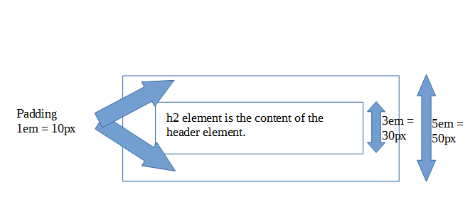
@RickSanch3z Your <h2> element must have 20px (2em) as font size, that’s what the assessment asks so you need to stick with that. Now, what they are asking is to align the heading in the header in a vertical way using only line-height, which takes either unitless values or px, em, percentages, etc. For our purposes, we have a height of 3em in our header (container) and 2em in our heading (content), so if we want to fill the content in the container we need to increase the content’s height by 1.5 times (3em/2em) and that’s the value you need for line-height.
1 Like
Hi,my css is here. Can give me some feedback?
/* General styles - put these straight into your stylesheet */
body {
margin: 0;
}
html {
font-family: ‘Helvetica neue’, Arial, ‘sans serif’;
font-size: 10px;
background-color: #ccc;
}
/* Selectors to be matched up with rulesets /
/
.card article img
.card footer
.card header
.card
*/
/* Rulesets to be matched up with selectors */
.card article img{
max-height: 100%;
float: right;
}
.card footer{
background-image: linear-gradient(to bottom,rgba(0,0,0,0), rgba(0,0,0,0.1));
border-radius: 0 0 1.5em 1.5em;
}
.card header{
background-image: linear-gradient(to bottom,rgba(0,0,0,0.1), rgba(0,0,0,0));
border-radius: 1.5em 1.5em 0 0;
}
.card{
width: 35em;
height: 22em;
margin: 5em auto;
background-color: red;
border: 0.2em solid black;
border-radius: 1.5em;
}
.card header,.card footer {
height: 3em;
padding: 0.8em;
}
h2,p {
margin: 0;
}
.card article{
height: 12em;
background-color: rgba(0,0,0,0.2);
color: antiquewhite;
padding-left: 1em;
padding-top: 1em;
}
h2{
font-size: 2em;
line-height: 1.5;
}
.card footer p{
font-size: 1.5em;
line-height: 1.5;
}
Hi Jeff,
Your code looks like it is definitely nearly there; nice work.
You can check your code against ours, see:
- Marking guide: mdn/learning-area/blob/master/css/introduction-to-css/fundamental-css-comprehension-finished/marking-guide.md
- Source code: https://github.com/mdn/learning-area/blob/master/css/introduction-to-css/fundamental-css-comprehension-finished/style.css 14
- Live version: https://mdn.github.io/learning-area/css/introduction-to-css/fundamental-css-comprehension-finished/ 6
Dear Chris,
I was hoping you could take a quick look at my code and give some feedback. The px value inherited from the html gave me a pause, but an easy fix once I realized everything needs to be calculated with 10px as basis instead of the usual 16px.
For whatever reason however, I can’t get the sizing of the whole box quite right. There’s this shadow under it, which is, I’m assuming, where the whole box should extend to (there’s no shadow in the example in the assessment article), but doesn’t.
The result is the following:
Here’s the code:
/* General styles */
body {
margin: 0;
}
html {
font-family: ‘Helvetica neue’, Arial, ‘sans serif’;
font-size: 10px;
background-color: #ccc;
}
.card {
width: 35em;
height: 22em;
margin: 5em auto;
background-color: red;
border: 0.2em solid black;
border-radius: 1.5em;
}
/* #1 */
.card header, .card footer {
height: 3em;
padding: 1em;
/box-sizing: border-box;/
}
/* #2 */
.card header h2, .card footer p {
margin: 0;
}
/* #3 */
.card article {
height: 12em;
background-color: rgba(0, 0, 0, 0.4);
}
/* #4 */
.card header h2 {
font-size: 2em;
line-height: 1.5;
}
/* #5 */
.card footer p {
font-size: 1.5em;
line-height: 2;
}
/* #6 */
.card article p {
padding: 1em;
color: white;
}
/* Header style */
.card header {
background-image: linear-gradient(to bottom,rgba(0,0,0,0.1), rgba(0,0,0,0));
border-radius: 1.5em 1.5em 0 0;
}
/* Footer style */
.card footer {
background-image: linear-gradient(to bottom,rgba(0,0,0,0), rgba(0,0,0,0.1));
border-radius: 0 0 1.5em 1.5em;
}
/* Main business card content */
.card article img {
max-height: 100%;
float: right;
}
Thanks.
Hi Martin,
Sorry for the slow reply! I’ve had a look at your code, and compared it to our finished version. The thing causing the problem is that you haven’t removed the default margins the browser automatically sets on headings and paragraphs from those in the header and footer, so that extra vertical height is putting the alignment of everything slightly wrong.
If you add this into your code:
.card h2, .card p {
  margin: 0;
}
You should see the whole thing line up nicely.
2 Likes
IT CLEARED MY DOUBT WHY THE EXTRA SPACE WAS COMING
Hi Chris,
Here is my code and its result (just a quick look and mark it!). Thank you so much in advance ![]()

  /*General Page Style*/
  html {
    font-family: 'Helvetica neue', Arial, 'sans serif';
    font-size: 10px;
    background-color: #ccc;
 }

 .card {
    width: 35em;
    height: 22em;
    margin: 5em auto;
    background-color: darkkhaki;
    border: 0.2em solid black;
    border-radius: 1.5em;
    padding: 1em;
 }

 .card h2, .card p {
margin: 0;
 }

 .card header, .card footer {
    box-sizing: border-box;
    height: 5em;
    padding: 1em;
 }
 /*Header styles*/
 .card header{
   background-image: linear-gradient(to bottom,rgba(0,0,0,0.5), rgba(0,0,0,0));
   border-radius: 0.5em;
 }

  .card header h2 {
font-size: 2em;
line-height: 1.5;
 }

 /*Main styles*/
 .card article img {
   max-height: 100%;
   float: right;
 }
 .card article {
background-color: rgba(0,0,0,0.1);
height: 12em;
 }

.card article p {
padding: 1em;
line-height: 1.3em;
font-size: 1.1em
}
/*Footer styles*/
.card footer {
   background-image: linear-gradient(to top, rgba(0,0,0,0.5), rgba(0,0,0,0));
   border-radius: 0.5em;
}

.card footer p {
font-size: 1.5em;
line-height: 2;
}
Hi there @saeid.marouski — this looks like some really good work — well done!
You have certainly got the main parts of the exercise right, albeit with some different colors; that is fine! The one thing I’d do is remove the padding around the card div, i.e. get rid of the padding: 1em; declaration out of the .card { } rule. I thought that looked a bit strange.
If you want to check your answer in more detail, you can check your code against ours, see:
- Marking guide: https://github.com/mdn/learning-area/blob/master/css/introduction-to-css/fundamental-css-comprehension-finished/marking-guide.md
- Source code: https://github.com/mdn/learning-area/blob/master/css/introduction-to-css/fundamental-css-comprehension-finished/style.css
- Live version: https://mdn.github.io/learning-area/css/introduction-to-css/fundamental-css-comprehension-finished/
Thank you for your response
Hi Chris,
Thanks for your reply. This is ancient stuff now as I didn’t log into here for a while, but any guess why this didn’t work with my original rule #2 (.card header h2, and .card footer p)? It’s basically the same thing with 1 more item added in the selector chain for specificity, right? Or am I missing something crucial?
Also, is the last thing in the assessment (getting the main paragraph to be padded) calculated to be exactly 1em, or is this just pretty much “eyeballed” to look right?
Kind Regards,
Martin
Hi Martin,
Hrm, you’ve got a point here. I seemed to miss your high-specificity rule that was doing the same thing. I’m not sure now, and would have to go back and revisit it at some point.
As for the padding thing — this is calculated exactly, but the calculation is easy. The header and footer both have padding on 1em set on them, so giving the paragraph padding of 1em makes them line up nicely.
Hi, Chrismills, could you give me any feedback on my fundamental CSS comprehension assessment? Here is CSS code
/* General page styles */

body {
  margin: 0;
}

html {
  font-family: 'Helvetica neue', Arial, 'sans serif';
  font-size: 10px;
  background-color: #ccc;
}

/* card container */
/*0010*/
.card {
  width: 35em;
  height: 22em;
  margin: 5em auto;
  background-color: red;
  border: 0.2em solid black;
  border-radius: 1.5em;
}

/* header and footer */
/*0011*/
.card footer {
  background-image: linear-gradient(to bottom,rgba(0,0,0,0), rgba(0,0,0,0.1));
  border-radius: 0 0 1.5em 1.5em;
}

/*0011*/
.card header {
  background-image: linear-gradient(to bottom,rgba(0,0,0,0.1), rgba(0,0,0,0));
  border-radius: 1.5em 1.5em 0 0;
}

/* main business card contents */
/*0012*/
.card article img {
  max-height: 100%;
  float: right;
}

/* new rules */
.card header, .card footer {
    height: 3em;
    padding: 1em;
}

h2, p {
    margin: 0;
}

article {
    height: 12em;
    background-color: rgba(0,0,0,0.25);
}

h2 {
    font-size: 2em;
    line-height: 1.5;
}

footer p {
    font-size: 1.5em;
    line-height: 2;
}

article p {
    padding-top: 1.8em;
    padding-left: 1em;
    color: white;
}
And I also have some questions. I don’t know how to use column combinator even if I had read the “Combinators and group selector”. And I also don’t know the difference between [attr|=val] and [attr^=attr], it seems that they both select all elements with the attribute attr for which the value starts with val. Could you help me solve this two questions?
Hi @Tom-Vanderboom!
I have looked at your code, and it looks really good; pretty much spot on except that the padding of the contract details was a bit off. You used this rule to style it:
article p {
    padding-top: 1.8em;
    padding-left: 1em;
    color: white;
}
If you changed it to
article p {
    padding: 1em;
    color: white;
}
It would be centered better (or we could use flexbox for even more accuracy). But it is a pretty minor point — great work overall!
Now on to your questions:
-
The column combinator is an experimental new selector designed to allow you to select items inside a certain column in an HTML table. But this is currently very experimental and doesn’t seem to work anywhere yet except experimental browser builds. This is not helpful to learning about selectors, so I’ve removed it.
-
The stuff about attribute selectors is all in https://developer.mozilla.org/en-US/docs/Learn/CSS/Introduction_to_CSS/Attribute_selectors, but there are quite a lot of options and it takes a while to digest the differences between all of them. The difference between these two is quite subtle:
-
[attr^=val]matches any element with an attributeattrthat has the stringvalat the start of its value. This is a more general case. -
[attr|=val]matches any element with an attributeattrthat has the stringval-at the start of its value, OR, has the stringvalas its entire value. This was added to CSS specifically to handle language codes, e.g. you can use it to matchlang="en"orlang="en-US".
You’re probably unlikely to use the second one very often, if ever. To make it clearer that this is a specialist option and not very commonly-used, I’ve moved it out of the main list in the article, and put it as a note below.
Thanks for answering! I have got it. Ummm, I also want to get some guidance in my structuring planet data assessment. Could you give me some advice?
Besides, I love study in MDN, I think that the person who wrote the document is really excellent!
Answered 
I wrote most of the MDN learning area, so your comment makes me very happy. Thanks!
Hi Chris,
I have noticed a one issue in the comprehensions example.
Part of the background is visible through the footer and header in the corner area.
Any ideas how to fix it?
Here is a picture. I changed color slightly so it is more visible.

Hi there @Henry-Z!
You are right — it took me a few seconds to see what you were talking about, but yes, it does show through a bit
If you want to get rid of this, you could set the border-radius value set on .card to about 1.7em.
1 Like
/* General styles - put these straight into your stylesheet */

body {

margin: 0;

}

html {

font-family: 'Helvetica neue', Arial, 'sans serif';

font-size: 10px;

background-color: #ccc;

}

/* card css */

.card{

width: 35em;

height: 22em;

margin: 5em auto;

background-color: red;

border: 0.2em solid black;

border-radius: 1.5em;

}

/* card header */

.card header{

background-image: linear-gradient(to bottom,rgba(0,0,0,0.1), rgba(0,0,0,0));

border-radius: 1.5em 1.5em 0 0;

}

/* card footer */

.card footer{

background-image: linear-gradient(to bottom,rgba(0,0,0,0), rgba(0,0,0,0.1));

border-radius: 0 0 1.5em 1.5em;

}

/* card article img */

.card article img{

max-height: 100%;

float: right;

}

/* new ruleset start here */

.card header,.card footer{

height: 3em;

padding: 1em;

}

/* remoove marging h2 p*/

.card h2 ,p{

margin: 0;

}

/* stop image from spilling out the main business card */

.card article{

height: 12em;

background-color: rgba(0,0,0,0.2);

}

.card header h2{

font-size: 2em;

line-height: 1.5;

}

.card footer p{

font-size: 1.5em;

font-weight: 500;

line-height: 2;

}

.card article p{

color: #fff;

padding-left:1em;

padding-top:2em;

}