I like the red banner, but understand the colour contrast issues raised. In general though it feels minimalist and light, and I like it.
1 Like
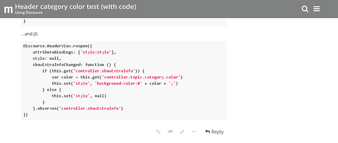
One solution I came up with to this problem was to change the colour of the header itself:
See it in action on staging.
1 Like
I personally like way more the red one, and would change colors over to white and red for bubbles and category separators. What’s the point of having category colors also in the top breadcrumbs?

