Me again! hehe Hi @chrisdavidmills. I’ve finished yesterday this styling table exercise and had one doubt: is there any way in CSS to get rid of the ugly juncture of images (thead and tfoot) or I should make the image wider? I prefer not to for a better responsive behavior and because If does exist, could be much easier to apply. This is the address and in the css file it’s that sepcific line commented:
Hello again - I like your styling; much easier to read than my crazy attempt
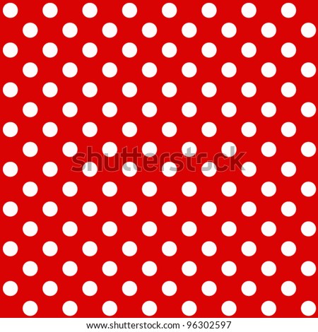
So, the problem you have here is that you are setting the background-size to 600px across, whereas the thead goes across the whole width of the table, longer than 600px. Because it is not long enough, by default it repeats to fill up the thead width.
In this situation you’d be better off not using background size at all, and instead finding yourself a thin slice of image that you can repeat horizonally to make the background pattern seamlessly.
hahah thanks Chris! (@chrisdavidmills) ! It’s more for a list of Metal Bands! hehe.
So instead of using background size (which I’ve understood will not work in older browsers) must use one image that could be sliced better. I think I could do it with this one and in that case would be better to achieve that with the narrower image possible? I mean… in this case doesn’t matter but could make much more difference in a big background, creating a tiny file if I could do it with just a pair of pixels and then let the image repeat itself. Did I explain? he. I swear I do my best with english! heheh
